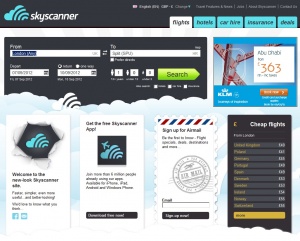
Skyscanner reveals new website design

Leading travel search site Skyscanner has unveiled a dramatic new redesign, rolling out the new look simultaneously across all platforms and markets in 29 languages.
“The launch date was only decided back in November and we have been flat out with the re-design since then,” said marketing director Frank Skivington.
He explained the drive behind the new look and feel for the site: “We are very focused on design at Skyscanner, but probably with more emphasis on making the product as good as it can be - giving travellers a comprehensive one stop search site for flights, hotels and car hire and bringing clever new features and brilliant functionality to our users as fast as possible.
“The constant evolution and expansion of the site also means we are dealing with a moving target when it comes to design. And of course we also have the challenge of localising the brand for our many international sites, from Russian to Korean, so it has been an interesting project, to say the least!”
The new design has been developed with the aim of concentrating on the Skyscanner ethos of delivering a brilliant core offering, while keeping the interface simple, beautiful, fast and functional.
One of the objectives for the project was to reflect best practices in design for usability as well as look good, so customer testing and feedback sessions were built in to the redesign process.
“We’ve tried to make all these very popular elements easier to find and use, as well as paving the way for some very exciting new features and search options that will be launched later in the year,” concluded Skivington.

