Shangri-La celebrates half-century with new identity
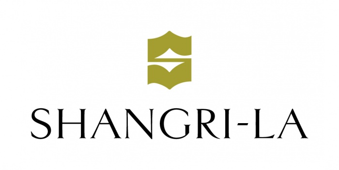
As part of Shangri-La’s 50th anniversary celebrations, the group has announced a refreshed brand logo for Shangri-La Hotels & Resorts (Shangri-La).
The design pays tribute to its past and sets a fresh vision for the future.
Beginning in Singapore in 1971 with the first hotel, Shangri-La’s story has been closely tied to Asia for 50 years.
The brand has expanded to key destinations around the world, inclusive of more than 80 hotels and resorts to date, bringing the best of Asian through heartfelt hospitality and joyful experiences for its guests.
The refreshed Shangri-La logo presents a more contemporary look and feel while maintaining the powerful equity of the brand.
ADVERTISEMENT
The signature “S” mark is retained and takes on a new gold colour that evokes “the warm glow of sunrise”, and the original typeface is refined for a more modern feel to align with the new design ethos.
Additionally, the brand has opted not to include ‘Hotels and Resorts’ in the refreshed logo, recognising that Shangri-La is more than a place, “but a feeling and an experience that inspires personal moments of joy”.
“Since our founding, Shangri-La has been known for our genuine and heartfelt care shown to guests and colleagues, hallmarks of our Asian heritage that make us unique and special to this day,” said Hui Kuok, chairman of Shangri-La Group.
“We are not moving away from our core values, instead, this customer-centric approach signifies our commitment to strengthening the connection between our guests and our brand experience.
“We operate in some of the most dynamic parts of the world where customer expectations are continuously evolving.
“Our brand evolution is our way of looking forward to the future and delivering on our promise of heartfelt hospitality in every moment across stay, wellness, family experience, gastronomy and more,” she added.
Find out more below:

